Submitted by Chris Hamilton via Econimica blog,
The Maginot Line formed France’s main line of defense on its German facing border from Belgium in the North to Switzerland in the South. It was constructed during the 1930s, with the trench-based warfare of World War One still firmly in the minds of the French generals. The Maginot Line was an absolute success…as the Germans never seriously attempted to attack it’s interconnected series of underground fortresses. But the days of static warfare were over – in 1940, the Germans simply drove around the line through Holland and then Belgium. Had the Germans replayed WWI and made a direct attack, the Maginot Line likely would have done its job. But Hitler wasn’t interested in a WWI re-do, so the fortifications were quickly rendered moot. France, Europe, and the world would pay the price for generals fighting the last war rather than adjusting to the contemporary risks they faced.
In 2008, the economic generals at the various central banks likewise pulled out the playbook to refight the great depression… not realizing, this time was an entirely different opponent. Federal governments and central bankers presumed doing what they had always done would again win the day. Cut interest rates (this time to zero) to incent both public and private entities to refinance existing debt loads and undertake new, greater leverage. This nearly free money would reduce debt service levels and the new loans would ignite a new wave of economic activity in the form of capital expenditures and small business creation. Economic multipliers and velocity would ensure general prosperity with job and wage growth. Instead, it’s the “Maginot Line” all over again for our economic generals as economic activity grinds to a stall absent the illusory asset bubbles.
BTW – if you are not a fan of charts or visual representations…this is not the article for you and likely best to stop here.
What changed?1- The Global Population of Young (Future Consumer Base) Ceased Growing…30 Years Ago. For hundreds if not thousands of years, global population growth rose at an annual rate of about 0.2% to 0.4%. Somewhere in the 19th century, the pace of population growth began rising significantly faster and headed to a global rate never seen before and likely never to be seen again. The rate of population growth peaked around 1970 and has precipitously fallen off since. However, despite the collapse in the rate of population growth, the total population has continued to rise due to the existing population living decades longer than the previous generation (chart below). |
Total Global Population vs. Annual Rate of Growth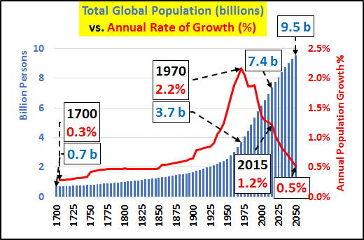 - Click to enlarge |
| The worlds population ceased growing in about 1988…since that time the world is only growing older. Below, global births per five year periods plus UN medium and low estimates. The double peak from ’85–>’90 and again ’10–>’15 is clear and as for the future, the reality will be somewhere between the medium and low estimates, but flat to declining births will be the order of the day. |
Global Births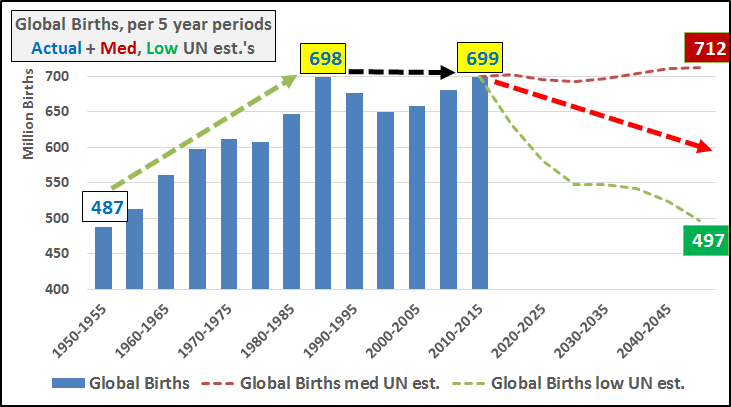 - Click to enlarge |
| So it only figures, if you tracked the population of young (0-4yr/old total annual population…chart below) that they would essentially cease growing. The population growth party was over…and it ended almost 30 years ago. |
Global Population - Click to enlarge |
| 2- The Worlds Population is Still Growing Due to a Surge in the Elderly Living Longer and High African Birthrates Offsetting Global Depopulation of Young
If there was no increase in the global number of births or the population of young…how did the world grow so much? The old living so much longer. The chart below shows the two ends of the life spectrum…the global populations of 0-4yr/olds vs. the 75+yr/olds. Both populations grew rapidly until ’90…but since ’90, the 75+ population has nearly doubled while the population of young isn’t budging. And by 2050, the population of elderly will surpass the population of young…undoing what was a 10:1 ratio in 1950. |
Global Population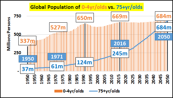 - Click to enlarge |
| Why is this a bad thing (economically)? 65+yr/olds consume at about 70% of the rate they did during their peak working years. By the time they are 75+yrs/old their consumption drops to about 50% to 60% of what it was during peak working years. They are credit averse, preparing for (or on) fixed incomes, and napping is one of their favorite activities and it doesn’t cost a thing.
3- Global Depopulation of young (excluding Africa) The chart below highlights global births per five year periods ex-Africa plus UN estimates for medium and low future births. Again, the reality will likely split the UN estimates but a clear peak in the late ’80’s and huge deceleration of births since is undeniable. |
Global Births Ex-Africa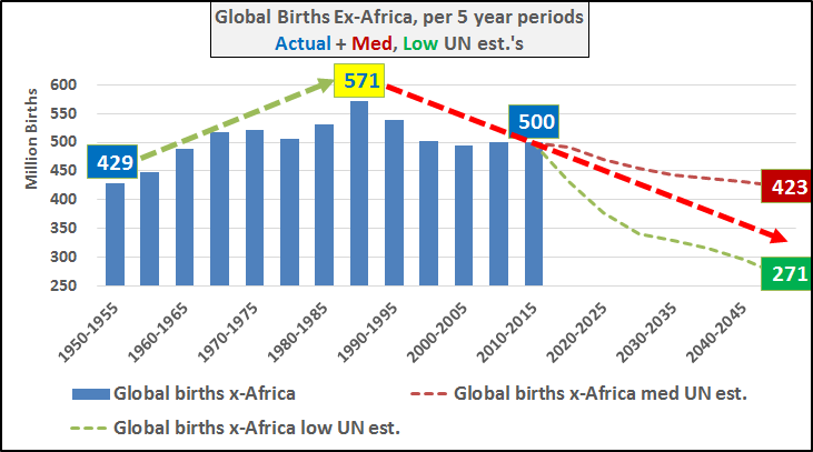 - Click to enlarge |
| The surging births in Africa plus medium and low UN future estimates. But sadly, absent income, without savings, without access to credit, and the world awash in overcapacity as it is…this population growth in Africa has no avenue to export themselves to prosperity or greater consumption. They are simply economically going to remain poor beyond belief and will not be capable of driving any significant economic activity. |
Africa Births - Click to enlarge |
| Excluding Africa, births from the remainder of the world are collapsing since the late 1980’s peak. And according to the UN’s best guestimates, births will only continue trending down world over (excluding Africa). Fewer births means fewer consumers, declining need for housing, commodities, and nearly everything else as this smaller population works it way through from the bottom up (also known as deflation or depopulation).
What people struggle to understand is that our present system is all about growth and it is the population growth of .05% or 1% which drives economic activity magnitudes larger. This relatively small population growth % drives huge spending on infrastructure, home building, factories, supply chains, etc. The differing impact of 1% or 0.1% population growth is felt far beyond a 1% or .1% economic growth…more like 10x’s that impact. But population growth isn’t slowing across the board. It is the huge population declines of the young among the combined wealthy 35 OECD nations (list of members HERE), China, Russia, & Brazil vs. the still growing but decelerating RoW (rest of the world…but really Africa). So, the 0-4yr/old combined OECD, China, Russia, and Brazil population peaked in 1991 and has steadily declined since, now down over <-22%>. The combined 0-4yr/old population growth among the relatively poor RoW was barely able to offset the declines of the relatively wealthy developed since ’91 (chart below). |
Global Population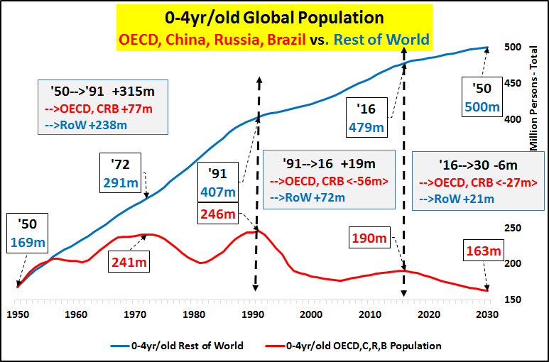 - Click to enlarge |
| High fertility rates and population growth in Africa are solely offsetting the contracting populations of young across the remainder of the world. The chart below highlights global fertility rates for 2016….where the global population growth is coming from. In two words, Central Africa. |
World Maps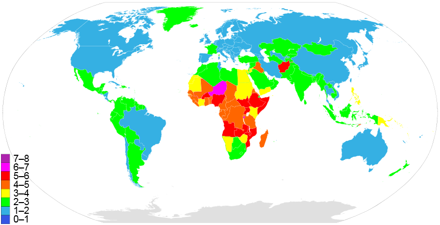 - Click to enlarge |
| Those highlighted in yellow, orange, red, and magenta (indicating nations that, on average, have 3 to 6+ children per female) are almost entirely located in Africa. Uganda, Somalia, Burundi all have birthrates near 6 children per female and the most populous African nation, Nigeria (approaching 200 million citizens), has a birthrate of 5.1. Officially, 2.1 children per female is zero growth and the global fertility rate has fallen over 50% from it’s 1964 peak of 5.1 to 2.4 as of 2016…and all indications point to further declines.
Declining populations of young across the world has been made up for by growing populations of young in Africa. Something tells me, economically, this is not a good trade. Below, GDP per capita or purchasing power parity (PPP). Countries with low PPP in red (Central Africa), moderate in green, high in blue, and very high in magenta. Most global commodities and exports cost the same worldwide…so those with high PPP’s (and particularly those with relatively easy access to credit) can consume far more than those with low PPP’s. The bulk of nations highlighted in red (particularly in Africa) have PPP’s below $2000 a year…(and as low as $400/yr). Nations with annual PPP’s of $2000 are generally in-line with the GDP per capita of Haiti…their consumptive capability is equivalent to about 5% of US GDP per capita. |
World Map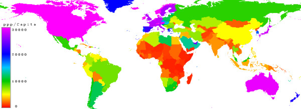 - Click to enlarge |
| How the worlds population is distributed, by global regions (chart below). Africa represents about 15% of the worlds population but at least 100%+ of population growth. |
Global Population Geographic Distribution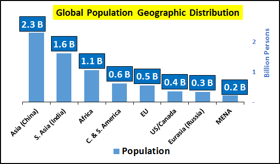 - Click to enlarge |
| Below, net 2016 fertility rates as per those regions. Shortly, all regions will likely be negative…except Africa. |
Global Fertility Rates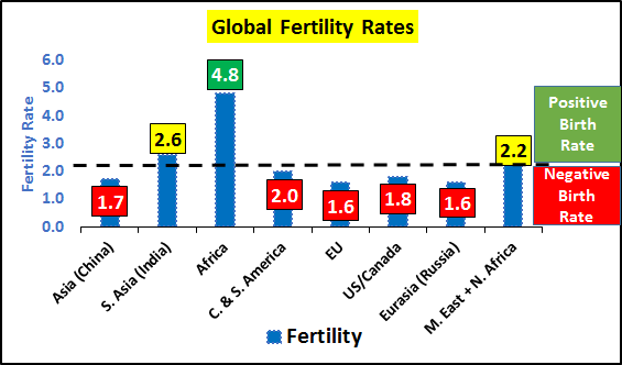 - Click to enlarge |
| Below, world population excluding Africa…further broken down by the under 45 and over 45yr/old populations. |
World Population ex-Africa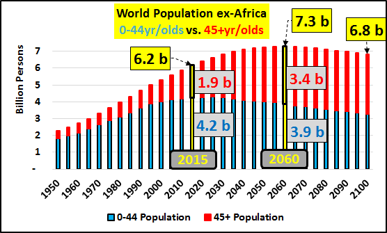 - Click to enlarge |
| Global 0-44yr/old population, excluding Africa (chart below). This is the child bearing population…as their total number shrinks compounded by collapsing birth rates, a far larger population decline could be in store than anticipated. |
World Population ex-Africa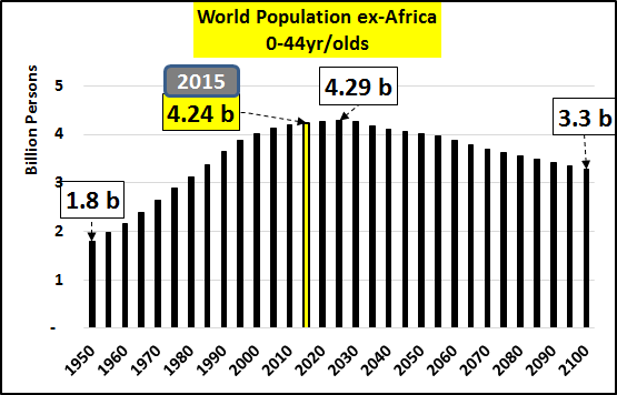 - Click to enlarge |
| Global 45+yr/old population, excluding Africa. This is how the world is growing…by growing older (chart below). |
World Population Africa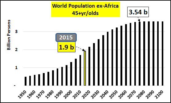 - Click to enlarge |
| Global 0-44 vs 45+yr/old population change, per 5yr periods (chart below). No, the world is coming to the rescue…if the world is seen through a lens excluding Africa, the 0-45yr/old population growth is essentially over. The population capable of bearing children has chosen not to…and is now itself declining in size. The global economy will never be the same. |
Global Population Change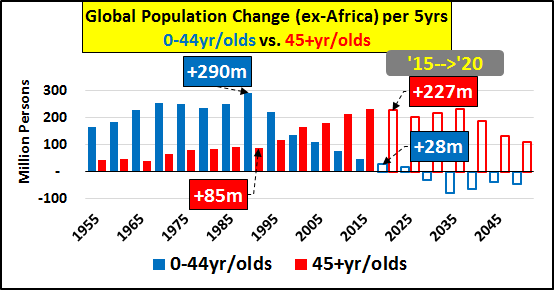 - Click to enlarge |
| 2017 is the last sliver of light for the nations that collectively consume 70% of global oil and represent about 80% of all global import markets. The combined 0-64yr/old population of the 35 OECD nations plus China, Russia, and Brazil grows just one million persons in 2017 or 0.1% (chart below). After that, the declines begin, slowly at first but picking up speed to the downside every year. What was an influx of up to 30 million new consumers annually with the income, savings, and access to credit will now be a declining consumer base for the rest of our lives. |
Annual Population Growth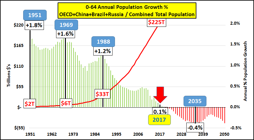 - Click to enlarge |
| The reason Japan and Germany were able to maintain their economies once their own internal 0-64yr/old consumer bases were declining was an emphasis on exports to a still growing export market. Looking at the annual population growth of the 0-64yr/old importer nations (OECD, China, Russia, Brazil), the chart below highlights when, in turn, major nations / trading blocks 0-64yr/old populations turned negative. We see that the final support for global consumption, China, turns negative this year. As you see below, that pool of seemingly endless demand for import growth goes dry this year.
So, what about the US? The data that represents the US economy, charted out with a minimum of opinion. You decide what it means. |
Annual Population Growth - Click to enlarge |
US Population growth & Makeup of that Growth –The change, per five year periods, of the 0-44yr/old population vs. the 45+yr/old population (chart below). The UN medium population growth estimate is included through 2050 (the 45+ estimate is a lock but the 0-44 is highly optimistic and slowing birthrates almost surely means there will be significantly less 0-44yr/old growth than indicated). |
US Population Change - Click to enlarge |
| Total US Debt & US Full Time Jobs – The change, per period, of net full time job growth vs. total debt growth (private and public…chart below). |
Debt vs Full time jobs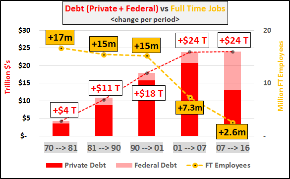 - Click to enlarge |
| US Energy Consumption – Total consumption and fossil fuel consumption since 1950 in the chart below. |
US Energy Consumption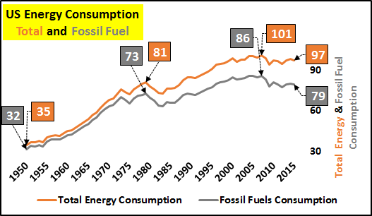 - Click to enlarge |
| Consumption change, per period in the below chart. Fairly self explanatory that growth of energy consumption ended and we are now contracting. Whether a shift from industrial to service economy, whether through higher efficiency, or a hundred other possible explanations for why…the declines are not debatable. |
US Total Energy & Fossil Fuel Conumption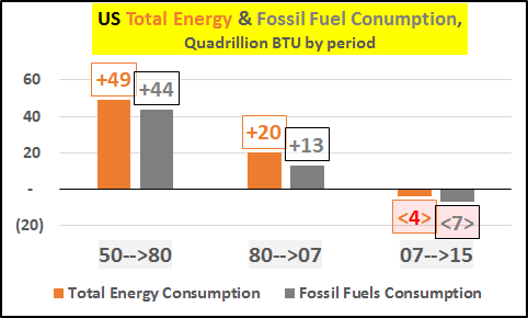 - Click to enlarge |
| Energy consumption, by type of energy (chart below). |
US Energy Consumption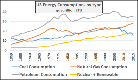 - Click to enlarge |
| Change in energy consumption, by type per period. |
US Energy Consumption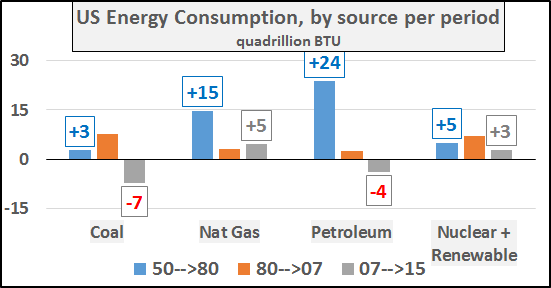 - Click to enlarge |
| Mortgage rates vs. Mortgage debt – Interestingly, lower FFR’s and mortgage rates did not incent more debt since 2007 (chart below). |
Mortgage Debt vs Mortgage Rates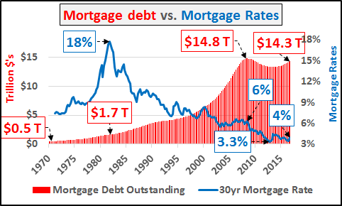 - Click to enlarge |
| Mortgage rates and mortgage debt, change per period (chart below).
From 1970 to 1981, as mortgage rates increased by 300%, mortgage debt increased by $1.2 trillion dollars (even unadjusted for inflation, this was a hug sum of money). This was a 350% increase in outstanding mortgage debt while the cost of funding these loans rocketed higher. However, since 2008, mortgage debt has fallen by a half trillion dollars despite a 50% decrease in rates. |
Mortgage Rates vs Mortgage Debt - Click to enlarge |
Breakdown of America’s CoreFinally, the cleanest and clearest point of breakdown was the end of population and employment growth among the 25-54yr/old population. This is the bedrock and foundation upon which the nations economy resides. As this group goes, eventually so goes America. |
Employees and Federal Debt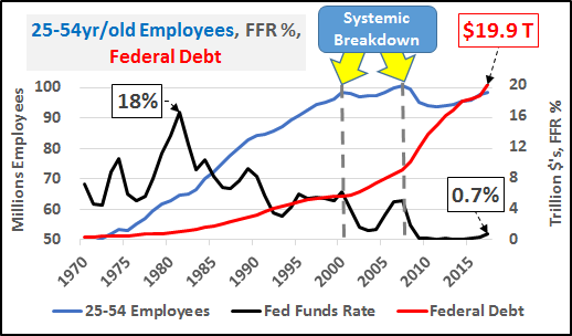 - Click to enlarge |
| The change in each, by period. |
Employees and Debt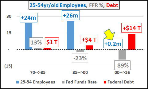 - Click to enlarge |
| Let’s not be naïve and pretend the bill isn’t coming…employed 25-54yr/olds, this ones on you. America played credit card roulette and you lost. America’s federal debt split evenly among you is now $202,000…up from $100,000 in ’07, $57,000 in ’00, and $20,000 in 1980. I hope you have been saving up because your real median household income is $57,000, slightly less than the $58,000 it was in 2000 and not much more than the $45,000 it was in 1980.
Unfortunately, we won’t find more growth in our future…population growth continues to be meager (and this assumes current rates of immigration plus an upturn in birth rates (premised on economic recovery)…if current patterns persist or worsen, perhaps all growth is gone). |
US Population Growth vs GDP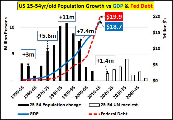 . |
Conclusion:Helicopter money, inflation, reflation, etc. are all premised on the idea that the economic slowdown is a temporary feature and that if the business cycle can just be restarted, things will be like they “always were”. However, what I’m showing is things will never again be like they were…at least not in our lifetimes. In fact, aggregate economic growth should no longer be the goal and attempts to maintain the current unsustainable status quo are only further harming us. It’s long overdue to acknowledge we face a future absent net growth and likely a future with fewer consumers, fewer homebuyers, fewer taxpayers, fewer employees. We face a battle where higher productivity leads to ever more being done by ever fewer people…and it only follows that the declining population with even faster declines in employment will consume less. If we aren’t thoughtful, honest, and creative in how we adapt to this new reality…terrible consequences could await us. |

Full story here Are you the author?
Tags: Belgium,Brazil,central banks,China,economic growth,ETC,fixed,France,Germany,Global Economy,Great Depression,Japan,newslettersent,OECD,purchasing power,Reality,Switzerland