Found 151 search results for keyword: label/Great Graphic
Great Graphic: Vulnerability of the Canadian Dollar
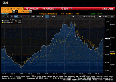
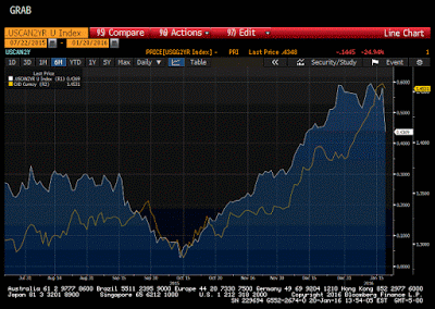
The Canadian dollar appears vulnerable. It remains firm while the US two-year premium over Canada has risen sharply. Like others, we do not expect the Bank of Canada to cut rates today and are looking past it. This Great Graphic was composed on Bloomberg. It shows the 2-year spread (white line) and the US dollar …
Read More »
Read More »
Great Graphic: US 2-year Premium over Germany and Japan at New Cyclical Highs
We argue that the dollar is in its third significant rally since the end of Bretton Woods in 1971. The Reagan dollar rally was driven by the policy mix of tight monetary policy and loose fiscal policy. The G7 effort to stop the dollar's appreciation at the Plaza Hotel in September 1985 marked the end … Continue...
Read More »
Read More »
Great Graphic: Inflation Expectations via 10-Year Breakevens
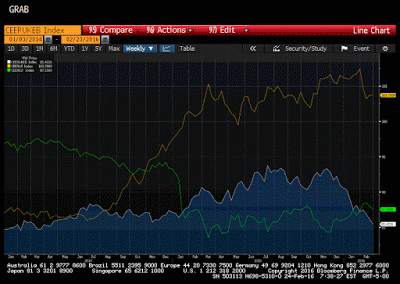
Over the next fortnight the major central banks, including the ECB, BOJ, Fed and BOE will hold policy-making meetings. Of the four, expectations are the highest for the ECB to ease policy. Given the poor economic data, including deflationary pressures, and the tightening of financial conditions, the BOJ could also adjust policy. However, after the …
Read More »
Read More »
Great Graphic: Surplus Capacity is not the Same as Insufficient Aggregate Demand
Many economists argue that the key challenge is that of insufficient aggregate demand. That is why world growth is slow. Hobbled with debt, households have pulled back. Business investment is weak. Government dissavings has been offset by household and business savings. The solution offered by some economists is a large public investment program. The G20 …
Read More »
Read More »
Great Graphic: Gold Triangle–Continuation or Reversal Pattern?
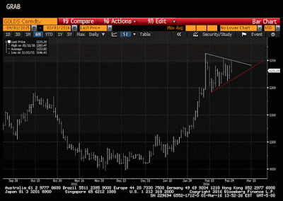
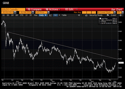
During a period in which the zero bound no longer is the floor of interest rates, and many central banks continue to ease policy, we have been watching gold a bit closer. In early January, we noted that the technical pattern warned of breakout. Our first objective was $1110-$1135. In early February, we updated our …
Read More »
Read More »
Great Graphic: Trade-Weighted Look at Major Currencies
When considering the impact of changing currency prices on an economy, trade-weighted measures are appropriate. The Federal Reserve has cited the dollar's appreciation as a headwind on the economy and a depressant on prices.
Given the moves in...
Read More »
Read More »
Great Graphic: Dollar May Be Less Important for Fed
Investors and policymakers continue to wrestle with the economic impact of the dollar's rise. The Federal Reserve has argued that the dollar's appreciation acts as a headwind on exports and dampens imported inflation. At the same time, despite the dollar's appreciation and the fall in oil prices, core inflation rose steadily last year. Core CPI …
Read More »
Read More »
Great Graphic: Gold after its Trough?
It had taken out a three-month downtrend line, which we suggested was part of a triangle pattern. Gold also traced out a double bottom pattern. The triangle pattern pointed to a move toward $1110 and the double bottom projected to around $1135.
Read More »
Read More »
Great Graphic: Falling Equities and US Treasuries Blunt Impact of BOJ’s Surprise
The yen is the strongest currency today. Many are still referring to it as a safe haven. However, this strikes us as a misuse of the concept. Investors are not flocking to the yen to find quiet place to ride out the storm. Rather the yen's strength is a reflection of the turmoil. As we … Continue reading »
Read More »
Read More »
Great Graphic: World Equities and Oil
Equities and oil continue to be moving in the same direction. During the first few weeks, they were moving down together and now up together. It is frustrating for asset managers. Large cap and small cap stocks moving together as if everything is being tarred with the same brush. We continue to try to tease … Continue reading...
Read More »
Read More »
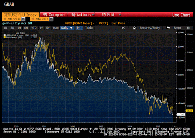
Great Graphic: Canadian Dollar Resilience in Face of 7% Drop in Oil
This Great Graphic, composed on Bloomberg, shows two-time series. The white line is the premium the US government pays to borrow over the Canadian government for two years. The yellow line the US dollar against the Canadian dollar.
Even th...
Read More »
Read More »
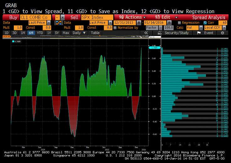
Great Graphic: S&P and Oil–Conjoined Twins or Distant Cousins that Sometimes Look Alike?
The US stock market and the oil market appear joined at the hip. The Great Graphic here, created on Bloomberg, shows the correlation of the two markets. It is near 0.77, which is the highest since September 2013.
The correlation was condu...
Read More »
Read More »
Great Graphic: Shanghai Composite and the S&P 500
I was canoeing recently. When I looked that oar in the water, it looked bent. It wasn't my equipment, and I am a novice. I cursed to myself and quickly pulled the oar from the water. I smiled. It was not bent. It was an optical illusion.
...
Read More »
Read More »
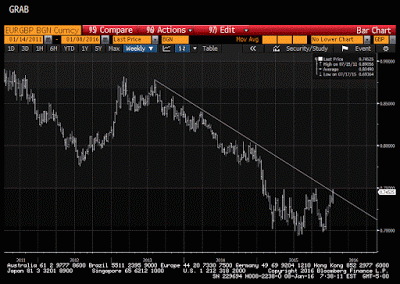
Great Graphic: Euro Flirting with Downtrend Against Sterling
Tactically, there seems to be two broad ways a short-term participant can trade this. The first is to buy the euro on a break out. The second way is to fade the patter. This entails selling the euro as it approaches the GBP0.7500 level. Which...
Read More »
Read More »
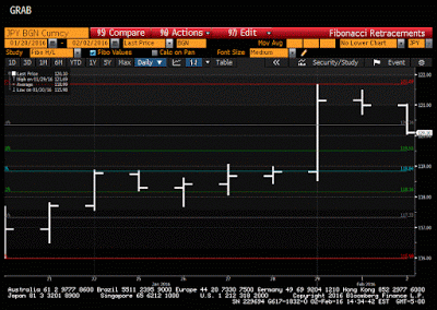
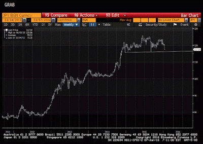
Great Graphic: Possible Head and Shoulders in Dollar-Yen
The dollar has broken down against the yen. Although many talk about safe haven role for the yen, this seems to be a misconception. Investors are not buying the yen to escape the turmoil of the markets.
The yen's strength itself is th...
Read More »
Read More »
Great Graphic: The Euro Touchstone
This Great Graphic is a favorite of mine. Created on Bloomberg, it depicts the 2-year spread between Germany and the US on two-year money (white line) and the euro-dollar exchange rate (yellow line). The chart covers the past five years. The scales of the two time series are different so it makes little sense to … Continue reading...
Read More »
Read More »
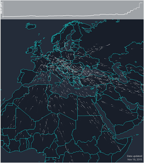
Great Graphic: Visualizing the Refugee/Asylum Seekers in Europe
The Greek crisis that dominated the European discussion in the first half of the year was barely ending when attention turned to the refugee problem. While it often seemed that all of Europe was united against Greece, the refugee problem is si...
Read More »
Read More »
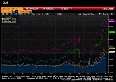
Great Graphic: US Bill Yields and Fed Hikes
There are many investors and observers who do not think the Fed ought to raise interest rates today. The Fed's targeted inflation measure, the core PCE deflator, stood at 1.3%, well below the 2% target. They see the fresh sell-off in oil prices and are more concerned disinflation than inflation. Over the past week or so, …
Read More »
Read More »
Great Graphic: US Equities in December
This Great Graphic shows how different measures of US equities perform in December by day for the past 20 years. I got it as a tweet from Urban Carmel, who got it from the Stock Almanac. Today is eleventh session of the month. Equities typically rallied starting now in December. Since 1994, the S&P … Continue reading...
Read More »
Read More »
Great Graphic: Large Yuan Devalution in 2016?
Following the mini-devaluation in August, the yuan appreciated in September and October. It began depreciating again in November and this has continued through the first half of December. The dollar finished the local session at new multi-year highs against the yuan. Many observers see in the pre-weekend announcement about monitoring the yuan against a basket …
Read More »
Read More »


