Charles Hugh Smith
My articles My offerMy siteAbout meMy videosMy books
Follow on:TwitterFacebookYoutubeAmazon
If you believe you’ve front-run the herd, you’re now in mid-air along with the rest of the herd that has thundered off the cliff.
We’re awash in financial charts, but only a few crystallize an entire year. Here are the two charts that sum up everything you need to know about the stock market in 2020.
Put another way–these are the two charts you need to ignore or rationalize away–unless you’re a Bear, of course, in which case you’ll want to tape a printed copy next to your wall of curled Post-It notes for future reference.
These charts show that all the potential gains from a thee-year advance (2019-2021) in P-E multiples and stock valuations have already been front-run in a mere three months. This is a key dynamic in the diminishing returns on Federal Reserve stimulus.
|
This is an important point that few seem to observe. Once market participants observed how the Fed’s QE (and “Not-QE”) have pushed stock multiples and valuations higher again and again, they now front-run the “guaranteed” gains. Market dynamics being what they are, this manic buying in anticipation of years of future gains compresses all future buying into the three months of manic front-running. In effect, all the potential gains of three years of Fed stimulus (QE and “Not-QE”) have already been skimmed in the three months since the Fed launched “Not-QE”. 2019’s nearly 30% gains in stock valuations wasn’t the result of soaring operating income or profits; it was all multiple expansion based on front-running the Fed’s stimulus. While the Fed generated 3 years of gains from each of its previous QE stimulus programs, now all the gains have been taken in only three months: that’s the acme of diminishing returns: now that the Fed brought three years of buying forward into one quarter, what’s going to push a blow-off top in stocks even higher for the next two years? If you answer “$60 billion a month in Fed stimulus,” you’ll get your head handed to you on a platter, as all the gains from “not-QE’s” $60 billion a month have already been front-run. Another point few seem to notice is that as the stock market has ballooned in value, the Fed’s QE is diminished as a percentage of market valuation. In other words, the Fed’s stimulus is increasingly nothing more than signal noise, as depicted in this chart showing the Fed’s $60 billion per month “not-QE” in relation to the $33 trillion stock market. |
Fed monthly vs US Stock Market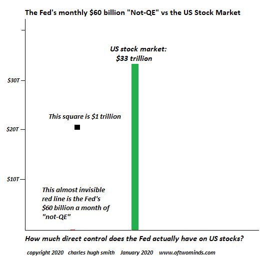 - Click to enlarge |
| As recently as February 2016, total market cap of U.S. stocks was less than $19 trillion. The value of U.S. stocks have risen by almost 75% in a mere four years, yet the Fed’s QE is supposed to have the exact same effect in an $33 trillion market as it did in an $18.9 trillion market?
And this assumption is based on what, other than magical thinking? Speaking of magical thinking, take a look at Apple’s operating income, which has actually declined while its price per share doubled from $145 in January 2019 to $293 in January 2020. Other than mass delusion or Martian Mind Control, the only possible explanation for the doubling of the value of a company whose operating income is at best stagnant is the same dynamic: punters have front-run all the potential gains of the future to double Apple’s share valuation in one year. All those analysts predicting a billion Apple Watch sales to recession-impoverished consumers and Apple eating Disney’s lunch because Apple has squandered millions on entertainment “talent”–you’re joking, right? Every attempt to replace declining iPhone revenues with “services” or “wearables” in an exercise in magical thinking. Look at the chart, people: Apple’s operating income is at best flat. How the human mind spins stagnation into another $500 billion in valuation can only be understood as Pavlovian front-running, which can also be understood as the herd thundering off the cliff. |
Apple, Operating Income, 2006-2019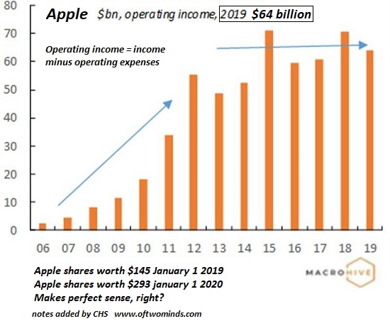 - Click to enlarge |
If you believe you’ve front-run the herd, you’re now in mid-air along with the rest of the herd that has thundered off the cliff, awaiting gravity to accelerate the herd into a fatal collision with the sharp rocks at the bottom of the cliff.
As for rationalizing away these charts–be my guest. But please don’t think magical thinking is a substitute for detached observation and realistic assessment.
Full story here Are you the author?
Tags: newsletter