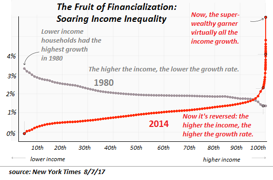
| This is the reality: the American Dream is now reserved for the top 0.5%, with some phantom shreds falling to the top 5% who are tasked with generating a credible illusion of prosperity for the bottom 95%. While questions about who is a replicant and who is real become increasingly difficult to answer in the films, the question about who still has access to the American Dream is starkly answered by this disturbing chart: |
US Household Income, 1980 - 2014 |
|
If you talk to young people struggling to make ends meet and raise children, and read articles about retirees who can’t afford to retire, you can’t help but detect the fading scent of a prosperity that has steadily been lost to stagnation, under-reported inflation and soaring inequality, a substitution of illusion for reality bolstered by the systemic corruption of authentic measures of prosperity and well-being.
In other words, the American-Dream idea that life should get easier and more prosperous as the natural course of progress is still embedded in our collective memory, even though the collective reality has changed: for the bottom 95%, life is typically getting harder and less prosperous as the cost of living rises, wages are stagnant and the demands on workers increase. Meanwhile, the asset bubbles inflated by central banks have enriched the top 10% of households, which own over 75% of all assets and take home over 50% of all household income.
“While most Americans are unprepared for retirement, rich older people are doing better than ever. Among people older than 65, the wealthiest 20 percent own virtually all of the nation’s $25 trillion in retirement accounts, according to the Economic Policy Institute.”
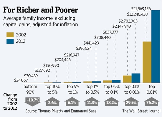
Household wealth follows a power-law distribution, i.e. the vast majority is held by the top few households: the top .1% own roughly 25% of all US household wealth, the top 1% around 40%, and so on. So the households between 80% and and 95% own a very modest percentage of what the top 96%-99% own.
The power-law distribution of wealth is visible in this chart:
|
Average Family Income, 2002 - 2012 |
|
Statistically, average per capita (per person) income and per capita share of GDP have risen substantially over the past the past 30 years. By these measures, everyone is considerably better off. Yet how many households are measurably better off in terms of free time, savings, disposable income, retirement accounts, financial security, reduction in debt loads, etc.?
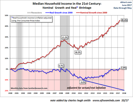
These two charts tell the real story of our economy: median household income (using the Consumer Price Index measure of inflation, which grossly under-estimates real inflation, as I explained in About Those “Hedonic Adjustments” to Inflation: Ignoring the Systemic Decline in Quality, Utility, Durability and Service) has gone nowhere since 2000. If income were adjusted by real inflation, the chart would show a 20% decline in purchasing power for all but the top 5%:
|
US Household Income, 2000 - 2018 |
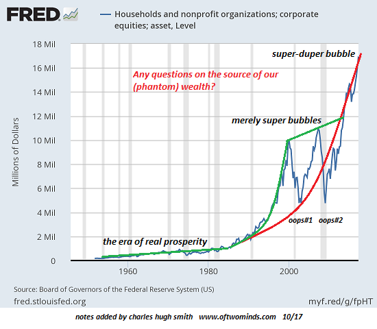
| This chart of household assets/corporate equities reveals the source of the phantom wealth propping up our simulacrum prosperity: |
Households and Nonprofit Organizations, 1960 - 2000 |
And please don’t claim corporate profits are soaring, so the valuations are justified. If you examine the Federal Reserve’s Z1 report, you’ll find that corporate profits are unchanged since 2014-no growth at all.
Full story here Are you the author? Previous post See more for Next post
Tags: newslettersent


