


George Dorgan
My articles My siteAbout meMy videosMy books
Follow on:LinkedINTwitterSeeking Alpha
CFA SocietyEconomicBlogs
Conspiracy ? Huge Differences Between the Payrolls Report and the Household Survey
based on the extracts of Robert Oak, Noslaves.com and his blog on Economic Populist
It’s a conspiracy!
The BLS is trying to swing the election! They’re cookin’ de books! By now you’ve seen the claims, accusations and mumblings by the pundits, press, twitter and blogosphere. So what really happened with this month’s unemployment report? (source Robert)
One of the first to remark this, was former General Electric ECO Jack Welch.
[tweet
Gluskin Sheff’s David Rosenberg
That the 7.8 percent jobless rate takes it to the level that prevailed when the President took office in January 2009 has raised many an eyebrow. I don’t believe in conspiracy theories. But I don’t believe in the Household Survey either.
This notoriously volatile indicator has become even more so in recent months. It showed a 195K slide in July and a 119K decline in August, to only then reveal a massive 873K surge in September.
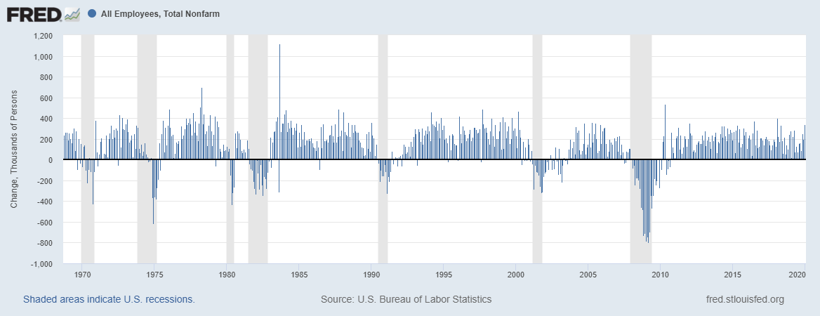
The BLS employment situation report actually is actually two separate surveys and this month the two really diverged. The CES or payrolls survey from businesses shows little payrolls growth, 114,000 jobs added, no even enough to cover the more than 200K new jobs need to cover population growth. In September 2011, the “Civilian non institutional population” was still 240.1 million but in September 2012, already 243.8 million. Since the last month, there were living 216’000 more people in the United States.
The household survey, known as CPS, shows an impossible gain of 873,000 more employed people and a monthly drop of -456,000 in those officially unemployed. The unemployment rate dropped from 8.1% to 7.8%. Most of the new jobs created were part-time jobs:

Overview CPS Household Survey - Click to enlarge
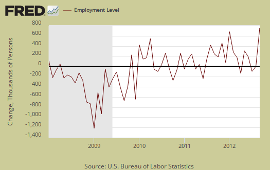
The CPS says the number of employed increased an astounding 873,000 in a month to a total of 142,974,000 employed people in the U.S. This is the largest change in employed that were not simply population statistical adjustments since March 2009, when the monthly change was -906,000. If one wants to only look at positive values, we need to go back to June 1983, where the employed increased by 991,000 to see that high of a monthly household survey employed growth. Below is a graph and you can see the outrageous jump. (see Robert)
Obama has managed now to recover 4 million from 8.8 million jobs lost in the financial crisis.

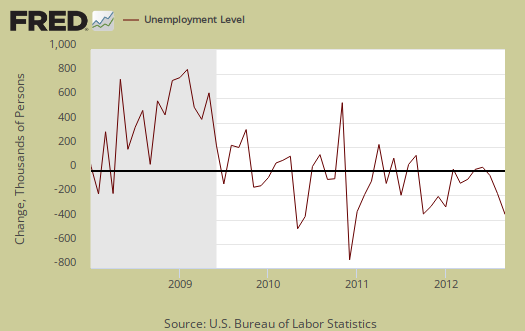
Somehow those unemployed dropped by a whopping -456,000 to a new level of 12,088,000. Below is the change in unemployed.
How can that be? How can in one month 873,000 people magically become employed when the job market is so pathetic and our GDP growth is barely treading water?
Margins of error, statistical relevance
One critical fact we need to know is the margins of error for the two surveys are different. The CPS has a ±436,000 monthly error ratio in employed, whereas the CES error margin is ±90,900. Ok, that’s still not enough to explain the other 437,000 people being counted as employed in a month, not accounted for in the standard margin of error…or is it?
Well, for one thing, if you want any accuracy, look at the CES, the nonfarm payrolls survey. The CPS is a monthly survey of 60,000 households whereas the CES is a monthly survey of 141,000 businesses and government agencies, with 486’000 work site. The CPS has to statistically extrapolate to cover the entire United States population and relies heavily on Census data, such as population adjustments. The CES, on the other hand, covers 486,000 establishments which provide employment and the survey results are what these businesses report as growth in their payrolls.
Additionally the CPS survey is a phone call asking regular people questions. The CES is a paper/email survey which asks businesses what their payrolls are and probably filled out by the person keeping the business books. Which survey method do you think would be more reliable for accuracy, just from the raw data collected?
We’ll have more deep analysis on why we got this crazy monthly report but the above should at least demonstrate such wild swings in the CPS are not that unusual and bottom line, if you want to look at monthly employment statistics, you should stick with the nonfarm payrolls survey

CPS Survey Households - Click to enlarge

CES Survey Non-Farm Payrolls September 2012 - Click to enlarge
In under the hood of the employment report, we describe the differences between the two BLS employment statistic surveys. What you need to know at the moment is the CES and CPS are not the same and cannot be mixed! Additionally, there are annual population controls which throw a monkey wrench in the monthly statistics which we discuss here and here. To show you cannot directly compare the two surveys, we show the household employed along with the nonfarm payrolls in the below graph and notice these series go all the way back to 1948. As you can see, they are completely different, ain’t the same statistical animal, as beastly as that is to the general public.
Is there anyway to compare the payrolls survey against the household survey? Why yes there is! The BLS does one better and releases monthly details on the differences between the CPS and CES surveys, along with fudge factors to smooth the variance. They give us a smoothed and adjusted series based off of the monthly household survey so we can compare it against actual payrolls. This month, after being adjusted, the household survey gives 294,000 jobs. This is still way off from the actual reported 114,000 job growth in payrolls. This 294,000 figure is also outside the margin of error of ±90,900 by 89,100 additional jobs. Below is a graph of the derived payrolls from the household survey that the BLS creates against the actual payrolls reported each month.
As we can see there is variance between the two, even after making adjustments to the CPS employed so we can directly compare it against monthly payrolls. Below is the raw total difference between the adjusted household survey against actual payrolls, on a monthly basis.
As we can see from the above graph, that difference has been increasing. Even with the household survey adjusted, it is still reporting a higher number of jobs than the CES payrolls survey indicates are really there. The difference for September was 2.007 million between the adjusted CPS versus actual payroll jobs.
Below is the monthly percentage difference between the smoothed and adjusted household survey of reported jobs versus the actual CES nonfarm payrolls reported. (source Robert)

CPS data adjusted to CES

Differences Adjusted CPS to CES
For September the percentage difference between the adjusted CPS against actual payrolls was 1.48%. What does all of this mean? Robert finds out a potential error of 150’000, simply based on the statistical definitions. More details on Economic Populist.
Have fun and tell the Census takers that you work for the government !
Another strange thing were the increasing government jobs, as Mike Shedlock remarked. They rose by 681K according to the household survey.

Rising Government Jobs CPS Survey September 2012 - Click to enlarge
According to the CES report, the establishment report, however, tells us that since July there were just 60K new government jobs. Another 600’000 jobs out of thin air.

- Government Jobs according CES September 2012 (source BLS: CES)
And Robert remarks:
The BLS does’t cook their books and this isn’t an October election surprise. That doesn’t mean we shouldn’t get our juices going over piss poor monthly labor force statistics. What we need are much better raw data collection methods, much larger survey sizes, additional raw data points, such as immigration status and better correlation to other labor data sources, such as W-2s and IRS tax data. The blame for that one is actually on Congress. They are the ones who fund the BLS and the Census and clearly raw data collection needs to be brought into the modern era and guess what, that costs money. Think about it, if the Census bugs you on the phone to answer a bunch of questions about your job life, are you going to be perfectly honest or even talk to them? Are you gonna grab all of your detailed financial information and accurately write it all down for a Census taker, even with some fava beans and a nice Chianti?
We didn’t think so, maybe the best idea to get rid of the Census takers is to tell that you work for the government…..
The way back to full employment
We should always remember that 8.8 millions jobs got lost, still 4.8 million need to be created to reach the level before the crisis. Yes, 4 million jobs have been created since the unemployment highs in October 2009, but the US population has risen by 7 million people, about 200’000 per month. This gives a total of 11.8 million jobs to be created.
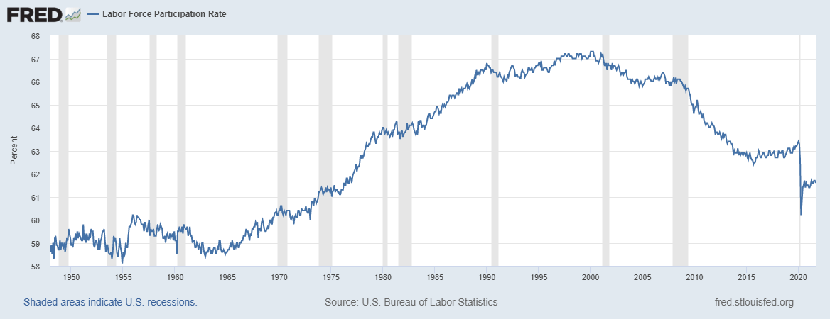
Why am I not excluding the steadily rising pensioners from my statistics and obtain 150’000 per month ? Simply because other countries are able to increase the participation rate to counter the bigger part of elderly. This was happening even in Europe (see here), but the rate of the US continues to decline.

Population United States Oct. 2009-2012

Participation Rate United States 2002-2012 - Click to enlarge
If we count two part-time jobs as one full-time, based on the latest CPS, the household survey, we can conclude that employment will rise by 600’000 per month. We see that it will be a nice pace, but it will still take 2 1/2 years to arrive at full employment.

How many month jobs creation based on CPS survey - Click to enlarge
If, however, we take the establishment survey (CES), then we will never get back to the glorious times.

New jobs based on CES survey - Click to enlarge
By the way, the next jobs report is scheduled just some days before the elections, a lot of new jobs now with a high error margin, this might imply a low number in November.
Are you the author?
Tags: Non-Farm,U.S. Nonfarm Payrolls,Unemployment,United States


