George Dorgan
My articles My siteAbout meMy videosMy books
Follow on:LinkedINTwitterSeeking Alpha
CFA SocietyEconomicBlogs
For most of human history, growth in output and overall economic welfare has been slow and halting. Over the past two centuries, first in Britain, Europe and America, and then elsewhere, it took off. In the 19th century growth the output per person—a useful general measure of an economy’s productivity and a good guide to growth in incomes—accelerated steadily in Britain. By 1906 it was more than 1% a year. By the middle of the 20th century, real output per person in America was growing at a scorching 2.5% a year, a pace at which productivity and incomes double once a generation. More than a century of introducing increasingly powerful and sophisticated machines was obviously a part of that story, as was the rising amount of fossil-fuel energy available to drive them.
But in the 1970s, America’s growth in real output per person dropped from its post-second-world-war peak of over 3% a year to just over 2% a year. In the 2000s it tumbled below 1%. Output per worker per hour shows a similar pattern, according to Robert Gordon, an economist at Northwestern University: it is pretty good for most of the 20th century, then slumps in the 1970s. It bounced back between 1996 and 2004, but since 2004 the annual rate has fallen to 1.33%, which is as low as it was from 1972 to 1996. Mr Gordon muses that the past two centuries of economic growth might actually amount to just “one big wave” of dramatic change rather than a new era of uninterrupted progress, and that the world is returning to a regime in which growth is mostly of the extensive sort.
source The Economist
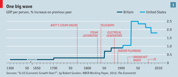
We do not want to go into more detail of Gordon’s projection, for us it is just the analysis that is important: The main drivers for him were electrification that, albeit some years, late helped to increase growth in 20th century, the PC between 1996 and 2004. It should be noted that the data is concentrated on the United States.
The economist shows the growth of advanced income, middle-income and low-income countries
The following chart with slightly negative connotations associates the phases of stronger and weaker growth with household wealth and certain phases of “bubbles”.

US household net worth 1952-2012 - Click to enlarge
The next chart shows how income is distributed over the last 20 years:

<– Back to Financial Cycles Overview