Richard C. Koo, Chief Economist of the Nomura Research Institute and of Balance Sheet Recession fame recently wrote a paper entitled “Central Banks in Balance Sheet Recessions: A Search for Correct Response.”
In this post I want to respond specifically to Koo’s remarks on the global Great Recession:
“These are extraordinary times for central banks. Near zero interest rates and massive liquidity injections are still failing to bring life back to so many economies in the developed world. If we set the pre-Lehman Shock level as 100, the Federal Reserve has increased monetary base to 347 today, while the Bank of England increased its monetary base to 433 during the same period, all under the lowest interest rates in their modern histories. Yet, the US is still suffering from an unemployment rate of 7.7 percent after four years of zero interest rates, and the UK is in the midst of a double-dip recession. The Bank of Japan has increased its monetary base from 100 in 1990 to 363 today, but instead of facing a triple digit inflation rate, it is facing a deflation. The European Central Bank has brought interest rates down to the lowest level in modern European history, but the unemployment rate at 11.9 percent is at the highest since the introduction of Euro. The increases in monetary base are shown in Exhibit 1.”
The thing that amuses most about this passage is I actually created a chart very similar to part of Koo’s Exhibit 1 only a few months ago. Naturally however my interpretation is somewhat different.
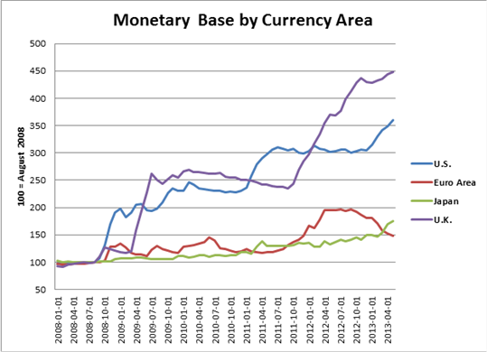 As of May the BOE’s monetary base is up by 348% since August 2008, the Federal Reserve’s up by 260%, the BOJ’s up by 75% and the ECB’s up by 48%. I think it’s very telling that Koo shifts to implicitly discussing the ECB’s monetary refinance operation (MRO) rate when discussing its monetary policy stance rather than the relative lack of growth in its monetary base. I also think it’s interesting that Koo shifts the base time period for BOJ’s monetary base all the way back to 1990, the start of the Lost Decade, when discussing the BOJ’s policy response to the Great Recession, and does so without supplying any frame of reference . In fact, as of August 2008 the BOJ had increased its monetary base by 124.2% from its average level in 1990. By comparison, as of August 2008 the Fed increased its monetary base by 200.3% from its average level in 1990, and based on data from the BOE’s Statistical Abstract, in August 2008 the BOE’s monetary base was 276.5% larger than the total liabilities on its balance sheet in 1990. Since neither the Fed nor the BOE suffered from excessively large reserves in August 2008, rather than shocked by how much the BOJ has increased its monetary base since 1990, one should be shocked by how little it has.
Here Koo discusses the shifts by the private sector around the globe towards financial surplus during the Great Recession:
“These unusual phenomena are all caused by the fact that private sectors in all of these countries are massively increasing savings or paying down debt despite record low interest rates. According to the flow of funds data, the US private sector (household, corporate and financial sectors combined) today is saving whopping 6.9 percent of GDP (four-quarter moving average ending in Q4, 2012) at zero interest rates The comparable figure for the UK is 3.8 percent, for Ireland 8.6 percent, for Spain 8.1 percent and for Portugal 7.0 percent of GDP (Exhibit 2) all with record low interest rates. In Japan, where the bubble burst two decades earlier, the private sector is still saving 8.8 percent of GDP at zero interest rates (Exhibit 3).”
“The shift here has been nothing short of spectacular. The US household sector, which had been the key provider of final demand for the global economy, stopped borrowing money altogether after 2008 (Exhibit 6). The US private sector as a whole went from a net borrower of funds to the tune of 4.8 percent of GDP in Q4 2008 to a net saver of funds to the tune of 8.7 percent of Q1 GDP in 2010, all with the lowest interest rates in the US history. This means the US economy lost private sector demand equivalent to 13.5 percent of GDP in just five quarters, pushing the economy into a serious recession. The UK lost private sector demand equivalent to 9.7 percent of GDP from Q2 2006 to Q2 2010. Spain lost 20.0 percent of GDP from private sector shift between Q3 2007 to Q3 2012, also with record low interest rates.”
In a previous post on Koo’s opinions concerning Japan’s Lost Decade I argued that the shift by the non-government sector towards financial surplus is driven not by its savings needs as a result of a Balance Sheet Recession, but rather the borrowing needs of the government sector that naturally occurs in the course of a serious recession. The following graph shows the additive inverse of the sum of the current account balance and the general government balance, which is essentially the non-government sector financial surplus, as a percent of GDP from 2009 to 2013 for the four major advanced currency areas according to IMF data:
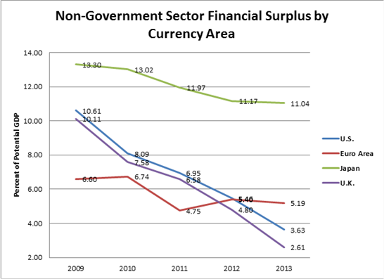 Note that dramatic reduction forecasted in the non-government sector financial surplus in the U.S. and the U.K. since 2009 in contrast to the much more modest declines in the eurozone and Japan. The declines in the non-government sector financial surplus of the eurozone and Japan need to be qualified by the fact that the current account balance of the eurozone and Japan have increased and decreased respectively over this period. But if Koo’s interpretation of these facts were completely symmetric, one would expect him to conclude that the U.S. and the U.K. are further along in their recoveries from a Balance Sheet Recession than the eurozone and Japan. But, as I argued previously, it is probably more correct to say these currency areas are simply further along in the process of fiscal consolidation.
Here is Koo on the lack of growth in private credit market debt since the beginning of the Great Recession:
“In acts of desperation, central banks in the developed world have flooded the financial system with liquidity in a policy known as quantitative easing or QE. In spite of massive injection of liquidity, however, credit growths in all of these countries, the key indicator of the amount of funds that was able to leave the financial system and enter the real economy, have been absolutely dismal.
If we set the pre-Lehman Shock level as 100, the US figure is 98 and the UK figure is 85 today. In the Eurozone, the credit stands at 101. These are shown in Exhibit 1. In other words, private sector credit in the West is either stagnant or shrinking after four years of astronomical monetary easing. In Japan, the private sector credit stands at 104 (1990=100) which is the same level as 20 years ago (Exhibit 7).
Stagnant or negative credit growth means the liquidity injected by the central banks could not enter the real economy to support private sector activities. It is no wonder that these economies are doing so poorly. None of these countries has experienced pickup in inflation rate either, with Japan still suffering occasionally from deflation.”
With the U.K.’s year on year consumer price inflation increasing from 1.1% in September 2009 to 5.2% exactly two years later, and remaining well above the target rate of 2% ever since, I seriously doubt the vast majority of British will agree with Koo’s last remark. More importantly Koo is evidently talking about the real value of non-government sector credit market debt in this section. It’s true that the economic recoveries of all of these currency areas are less than what many desire, consequently allow me to talk about an example of an economic recovery that was very fast in real terms and yet did not require an increase in real total (public and private) credit market debt: the 1933-37 recovery from the U.S. Great Depression.
A few posts ago I talked about Koo’s thoughts on the U.S. Great Depression. At that time I mentioned how, according to “Bicentennial Edition: Historical Statistics of the United States, Colonial Times to 1970”, nominal total credit market debt increased from $168.4 billion in 1933 to $181.6 billion in 1937 with nominal non-government sector credit market debt declining from $127.8 billion to $126.3 billion, and nominal government sector debt increasing from $40.6 billion to $55.3 billion. For comparison Nominal GDP (NGDP) increased from $56.4 billion in 1933 to $91.9 in 1937. What I neglected to mention on that occasion was how fast real GDP (RGDP) grew during this time period. RGDP grew by 43.6%, or at an average annual rate of 9.5%, and consequently the unemployment rate fell from 20.9% to 9.2%. The GDP implicit price deflator rose by 12.1%, so real total credit market debt fell by 3.8%, real non-government credit market debt fell by 11.9%, and real government sector credit market debt increased by 21.5%.
As enumerated by Frederic Mishkin in his best selling intermediate college textbook “Money, Banking and Financial Markets”, the Bank Lending Channel is only one of nine channels of the monetary transmission mechanism (MTM). It is not only possible for monetary policy to generate a rapid economic recovery without it, the U.S. Great Depression is an excellent example of just such a recovery.
Since the GDP implicit price deflator fell by 25.3% from 1929 to 1933, the increase in government debt from $30.1 billion to $40.6 billion from 1929 to 1933 represented a rise of 80.5% in real terms. In other words the rate of increase in real government debt was nearly four times greater during the contraction than during the recovery.
The fact that the rate of increase in government sector credit market debt slowed dramatically, and government sector debt actually fell as a percent of GDP, underscores the fact that this was overwhelmingly a monetary policy led recovery. Analysis by E. Cary Brown, Christina Romer, Barry Eichengreen and others shows that the contribution of fiscal policy to this unparalleled fast peacetime recovery, from what is perhaps the original example of what many call a “liquidity trap”, was at best relatively minor.
Here is Koo on money supply and exchange rates in the wake of the Great Recession:
“For example, the US monetary base grew from 100 at the time of Lehman Shock to 347 today as mentioned earlier, but the money supply grew only from 100 to 135 during the same period. In the UK where the monetary base now stands at 433, the money supply is stuck at a pitiful 110. In the Eurozone, the monetary base is at 157 while the money supply is at 107. In Japan, the monetary base is at 150 while the money supply is at 113. If the relative supply or scarcity of currencies is supposed to determine the exchange rate, the above numbers suggest that the Euro should be the strongest, followed by the pound, the yen and the dollar.
Instead, foreign exchange dealers and traders, who probably do not have time to think about the complicated link between monetary base and money supply during balance sheet recessions, simply assumed the textbook case where monetary base and money supply are expected to move in tandem (which was indeed true before the bursting of the bubble). Thus they assumed implicitly that the market is flooded with British pound and pushed it down to its lowest real effective rate in history by 2009.
The dollar, which recorded the largest increase in money supply during the period, remained stronger than the pound and the Euro. The Japanese yen, which had the second largest increase in money supply, became the strongest currencies of all, even though it had the lowest interest rates both at the long and the short end. The Euro which had the smallest money supply growth, replaced the pound to become the weakest of the four after 2012 (Exhibit 8).”
For his comparisons of money supply growth Koo seems to have chosen the Fed’s M2 measure, the ECB’s M3 measure, the BOJ’s M2 measure and the BOE’s M4 measure, without intermediate other financial corporations (IOFC), of money supply. This is my best guess based on the figures he provides, since he gives almost no description in his exhibit other than that of the BOE’s measure of money supply, and consequently he obviously provides no rationale for his choices. If I were of a suspicious nature I would almost suspect him of choosing the ECB M3 measure to minimize money supply growth given a relatively low exchange rate, of choosing the BOJ’s M2 measure to exaggerate money supply growth given a relatively low monetary base expansion and a relatively high exchange rate, and of choosing the BOE’s M4 ex-IOFC measure to minimize money supply growth given a relatively high monetary base expansion and a relatively low exchange rate.
In any case I’m going to repeat Koo’s exercise simply using the broadest monetary aggregate reported by each of the central banks: the Fed’s MZM, the ECB’s M3, the BOJ’s L and the BOE’s M4. Here is a graph of their relative changes since August 2008.
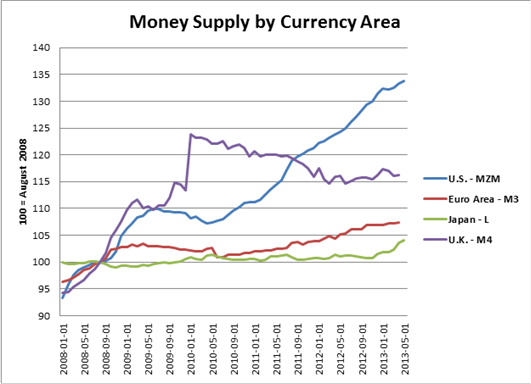 As of May the Fed’s MZM and the BOJ’s L are up by 34% and 4% respectively. As of April the ECB’s M3 and the BOE’s M4 are up by 7% and 16% respectively. In terms of monetary base growth the BOJ recently surpassed the ECB in April, so other than that recent change in positions and the temporary surge in the BOJ’s monetary base in March to August 2011, the relative money supply growth rankings of the ECB and the BOJ match the relative monetary base growth rankings very well. And since changes in broad money supply seem to lag changes in monetary base by several months, and given the current trajectory of the BOJ’s L, it’s likely that the BOJ’s L will surpass the ECB’s M3 in terms of relative growth before too long. On the other hand a consistent pattern between the relative money supply growth rankings and the relative monetary base rankings of the Fed and the BOE is far less easy to detect. Nevertheless it is clear that the two currency areas that have most significantly expanded their monetary base since the Great Recession have also led in money supply growth.
As for real effective exchange rates (REER) I’ve taken the liberty of constructing the same graph but indexing it to 100 in July 2008. I’m doing this because it’s my perception that foreign exchange rates everywhere began to move dramatically after July 2008, and I believe the large movements in exchange rates from then until March 2009 had much more to do with changes in central bank policy interest rates than monetary base growth. The following is a graph of the broadest REER indices available from the currency area’s respective central banks. Since the BOE only provides a nominal effective exchange rate for the pound sterling, I have used the ECB’s estimate of the pound’s REER.
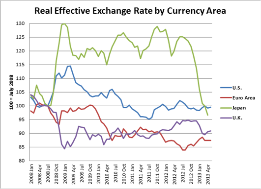 This is not too different from Koo’s graph but I believe the divergences in REER during the contractionary portion of the Great Recession are much more easily discernible. Now let’s review the history of the four central banks’ policy rates.
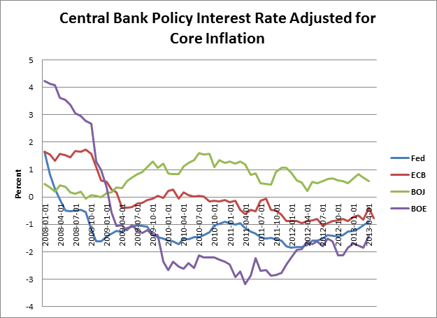
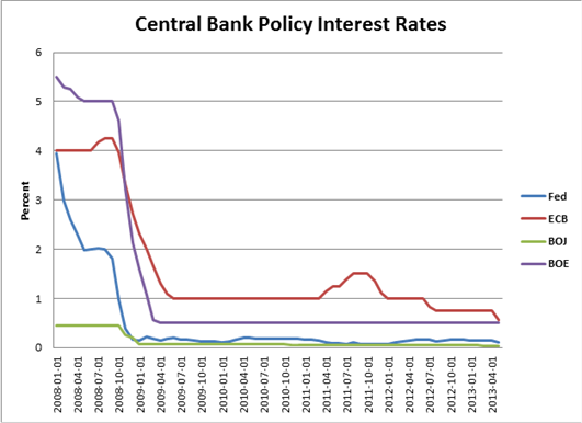 It’s worth noting that the ECB raised the MRO rate in July 2008 and again in April and July 2011, and in each case financial crisis followed soon thereafter. Since differences in real interest rates are more important than nominal interest rates as a determinant of exchange rates here’s a graph of central bank policy interest rates adjusted for year on year core consumer price inflation (PCEPI, HICP, CPI and CPI less energy and food for the U.S., eurozone , Japan and the U.K. respectively):
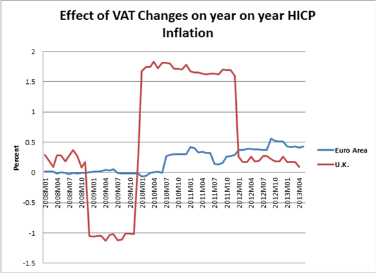
 And in the interests of refining this analysis even further, let’s take into account the effect of changes in the VAT on inflation. Here’s a graph of the year on year HICP minus year on year HICP at constant taxes for the eurozone and the U.K. I’ve made three minor adjustments to the U.K. data by interpolating the data for April and December 2009, and September 2012, in order to correct for what I perceive to be unexplainable excess volatility.
 In addition to adjusting for VAT changes there’s one more thing we need to take into account. It’s not the real interest rate that matters for determining changes in REER, but the change in the real interest rate. Here’s the graph of the change in real central bank policy interest rates since July 2007 at constant taxes.
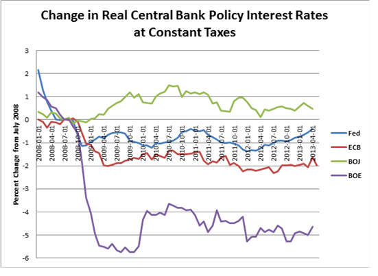 Now go back and look at the graph of REER and you’ll notice that the relative rankings are essentially correct with the exception of the euro’s REER which over time has dropped below the pound’s REER relative to their respective values in July 2008. We could try and make adjustments for other conventionally important factors such as changes in the current account balance (the eurozone is trending up and Japan and the U.K. are trending down), or productivity (real GDP per hour actually fell by 2.3% in the U.K. between 2007 and 2012), but in my opinion these other factors aren’t that important here.
Before considering the effect of QE let’s take a look at what is probably the main driver of the euro’s unusually low REER since late 2009, namely the eurozone sovereign debt crisis. It’s not hard to draw a connection between the eurozone sovereign debt crisis and the euro’s unusually low REER given the euro’s largest daily movements up or down in the foreign exchange markets these past few years have almost always been connected to this crisis. To help illustrate, here is a graph of 10-year bond spreads of the GIIPS nations relative to Germany.
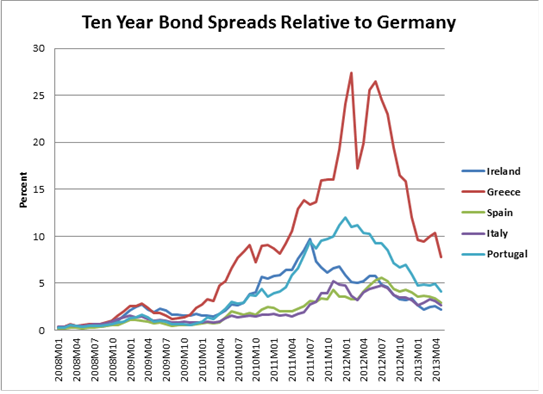 Inspection of the REER graph reveals that there were two major slides in the euro’s REER, one from October 2009 to June 2010 and another from April 2011 to July 2012. The first matches Greece’s initial surge in spreads which finally paused after Greek Prime Minister Papandreou, eurozone leaders, and the IMF agreed to the eurozone’s first sovereign bailout. The second slide started with Portuguese acting Prime Minister Socrates’ bailout request, was marked by peaks in the spreads for all of the GIIPS, and concluded shortly after Spanish Prime Minister Rajoy requested a bailout. Ironically the beginning of the second slide more or less coincided with the ECB’s decision to raise the MRO rate in April and July of 2011.
As for QE, I’ve found Brett W. Fawley and Christopher J. Neeley’s “Four Stories of Quantitative Easing” (Federal Reserve Bank of St. Louis Review, January/February 2013 Vol. 95, No. 1 pp. 51-88) to be the most useful summary of the myriads of programs impacting the respective monetary bases of the four major advanced currency areas since the Great Recession. Fawley and Neeley define QE as any program that unusually increases the monetary base, including asset purchases and lending programs. I think it is important, however, to distinguish between QE and lending programs (Credit Easing), and fortunately the authors at least recognize that many consider this to be an important distinction.
The Fed has engaged in three QE programs, colloquially named QE1, QE2 and QE3. QE1 was announced in late November 2008 and concluded at the end of March 2010, QE2 was hinted at in late August 2010 and concluded at the end of June 2011, and QE3 was hinted at in mid-August 2012. The U.S. dollar’s REER declined by 7.3% between the month of the announcement or hinting of the program to the month of the conclusion of the program for both QE1 and QE2. Following the first hints of QE3 in August 2012 the dollar’s REER declined by 2.3% through December 2012 but has risen since then, and as of May is only about a percent below where it was in August 2012. Thus it would appear that the Fed’s QE programs more than account for the 13.0% decline in the REER of the dollar between March 2009 and May 2013.
It’s important to note that much of the dollar’s rise since December is related to the yen’s decline. The yen’s REER plummeted by 22.8% between July 2012 and April 2013 with nearly two thirds of that decline occurring just since December. While the yen is only 7.281% of the trade weight in the Federal Reserve’s Broad Index of the Foreign Exchange Value of the Dollar, the decline in the yen since December accounts for practically all of the increase in the dollar since that time. I shall discuss the cross currency effects on the REER further when addressing the effect of the BOE’s QE on the pound sterling’s REER.
The ECB has focused on Credit Easing as opposed to QE. The only ECB programs that involved actual purchases of securities were the Covered Bond Purchase Programmes (CPBB1 and CPBB2) and the Securities Markets Programme (SMP), and all of these programs were completely sterilized, and so had no effect at all on the monetary base. The same thing applies to Outright Monetary Transactions (OMT), assuming that program is ever actually implemented. On the other hand the ECB’s lending under the Fixed Rate, Full Allotment (FRFA) and Long-Term Refinancing Operations (LTRO) programs have had a discernible, if transient, effect on the monetary base. But in the final analysis the ECB has never done any QE at all, a point that its leadership has been adamant about.
The BOJ announced outright purchases of Japanese government bonds (JGB) in December 2008 and this was later augmented by an announcement of purchases of commercial paper and asset back commercial paper (ABCP) under the Corporate Finance Instruments (CFI) program in January 2009. CFI was later modified to include corporate bonds in February 2009. Both of these programs concluded at the end of 2009 and supposedly made about 10 trillion yen in unsterilized asset purchases above and beyond what had previously been planned, and yet the monetary base only rose by 4.8 trillion yen over the entire course of 2009.
A third program, the Asset Purchases Program (APP), was announced in early October 2010 with the intention of making outright purchases of JGBs, Treasury discount bills, commercial paper, corporate bonds, exchange traded paper (ETF) and Japanese real estate investment trusts (J-REIT). All told additional purchases of over 70 trillion yen have been announced under APP and yet the monetary base increased only by about 30 trillion yen from October 2010 through February 2013. Thus in stark contrast to the ECB, the BOJ has been adamant that it has been doing QE, even going so far as to state that it is investing in a variety of private assets, and yet until April 2013 large changes in the monetary base were almost always undetectable.
The only time prior to April 2013 it was evident that QE was actually taking place was between February and April 2011 when the BOJ’s monetary base expanded by 20.9 trillion yen, or by 20.7%, largely in response to the Tohoku earthquake and tsunami, but the monetary base shrank by 8.4 trillion yen over the course of the next two months. The yen’s REER fell by 3.4% from February to April 2011 and then rose 2.9% through June. It wasn’t until July 2012 that the monetary base set a new record. And the 22.8% plummet in the yen’s REER between July 2012, and April 2013, nearly two thirds of which took place after December, occurred almost entirely in anticipation of a new large scale QE program that wasn’t officially announced until early April 2013 and, fortunately, initially exceeded expectations.
The BOE announced the Asset Purchase Facility (APF) in early March 2009. Following a few expansions, the first round of purchases, the majority of which were long-term gilts, was completed at the end of February 2010, although almost all of the impact on the monetary base had occurred by July 2009. A second round of purchases was announced in early October 2010 and after a couple of expansions it has yet to reach the 375 billion pound limit set in July 2012.
Try as one might, it is virtually impossible to find the predicted pattern of the BOE’s QE on the pound’s REER. But I think there is a perfectly rational explanation for why this is the case. The euro alone has a 47.64% trade weight in the pound’s REER, and counting the currencies of Bulgaria, Denmark, Latvia and Lithuania, which are all pegged to the euro, this rises to 48.92%. In contrast, the pound only has an 11.91% trade weight in the euro’s REER. In short, for the purposes of REER change analysis, the pound must be regarded as a satellite currency of the euro. For comparison, the dollar and the yen only have a 10.7% and 3.67% trade weight in the pound’s REER respectively, and the most that any of these other currencies’ trade weights is with respect to another currency is the dollar with respect to the yen which has a 25.82% trade weight. And whereas the euro (counting pegged currencies), the dollar and the yen together have a 63.29% trade weight in the pound’s REER, the most that the other three currencies’ trade weight sum with respect to another of these currencies is with respect to the yen, with the dollar, the euro and the pound together equal to 41.08% of the trade weight of the yen’s REER.
The period of time during which the BOE did its first round of QE, March 2009 through February 2010, overlaps with a lead the October 2009 through June 2010 period when the euro’s REER slid 12.9% primarily due to the unfolding Greek sovereign debt crisis. Similarly the BOE announced its second round of QE just prior to the sequential peaks in the Italian, Portuguese, Greek and Spanish bond spreads, which occurred in November 2011, and January, February and July 2012 respectively, and which concluded with Spain asking for a bailout, and consequently was coincident with the next great multi-month long slide in the euro’s REER.
In any case, although the currency depreciation that QE induces may be offset by currency depreciations in other currency areas, this in no way means that QE is ineffective. The main benefit from QE comes from increased aggregate demand (AD), which implies that any increase in foreign demand for exports induced by a decline in the REER would be at least partially offset by increased domestic demand for imports. Indeed, as I observed in my last post, this happened following Japan’s first QE in 2003-07, when both imports and exports soared, and net exports as a percent of GDP barely increased. In fact it also occurred during the initial U.S. recovery from the Great Depression in 1933-37, when the more than 40% devaluation of the dollar led to an approximate doubling of both exports and imports in nominal terms, and a decline, not an increase, in the trade surplus.
So since AD is the appropriate measure of the effectiveness of macroeconomic policies whose ultimate purpose is in fact to stimulate AD, perhaps we should look at the relative AD performance of the four large advanced currency areas since the Great Recession. But before we do that, we should take a look at the other main policy tool for stimulating AD, namely fiscal policy.
In my opinion the most objective way of measuring fiscal policy stance is the change in the general government cyclically adjusted balance, particularly the cyclically adjusted primary balance (CAPB). The cyclically adjusted balance takes into account any changes in the general government budget balance due to the business cycle. Thus changes in the cyclically adjusted balance are mostly due to discretionary fiscal policy, and consequently may be taken as a proxy for the degree of fiscal stimulus. The CAPB goes a step further, factoring out changes in net interest on government debt and thus ensuring that practically all of the changes in fiscal balance are discretionary in nature. The following is a graph of the changes in CAPB by currency area over the calendar years 2009-13. All data comes from the April 2013 IMF Fiscal Monitor.
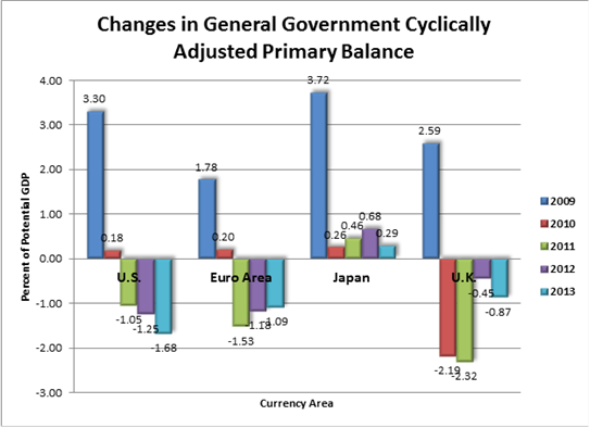 The first thing you should note is that Japan has had the most expansionary fiscal policy every year without exception. And although all of the currency zones adopted a much less expansionary fiscal policy stance in 2010, it was the U.K. that took the lead in fiscal consolidation, having the most contractionary fiscal policy in both 2010 and 2011. The U.S. has had the most contractionary fiscal policy starting with calendar year 2012.
Now, let’s take a look at relative AD performance. To be technical, AD is nominal GDP (NGDP) when inventory levels are static (i.e. nominal Final Sales of Domestic Product). Thus for all intents and purposes AD is virtually identical to NGDP. The following is a graph of the NGDP of the four big advanced currency areas with NGDP indexed to 100 in 2008Q2, that is, before large scale monetary base expansion started in September 2008.
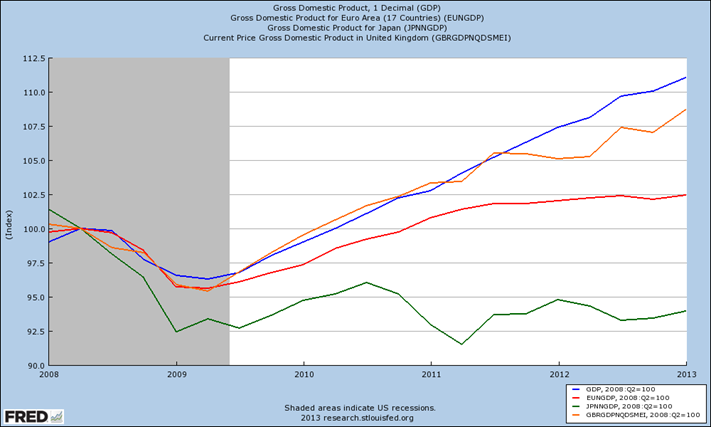 Note that the U.K. led in relative NGDP growth from 2009Q3 through 2011Q3 with the sole exception of 2011Q2. The U.K. also led in relative monetary base growth from June 2009 through January 2011 and relative money supply growth from July 2009 through August 2011. And as previously noted the U.K. had the most contractionary fiscal policy in 2010 and 2011.
The U.S. has led in relative NGDP growth since 2011Q4. The U.S. also led in relative monetary base growth from February 2011 through January 2012 and has led in relative money supply growth since September 2011.And as previously noted the U.S. has had the most contractionary fiscal policy starting with calendar year 2012.
Japan has ranked last in relative NGDP growth throughout. Japan has also ranked last in relative monetary base growth with the exception of March through August 2011 and since April 2013, and Japan has ranked last in relative money supply growth throughout with the sole exception of June 2010. And as previously noted Japan has had the most expansionary fiscal policy throughout.
I believe in this particular instance the facts speak for themselves: It´s mostly about monetary policy.
See more for


