Charles Hugh Smith
My articles My offerMy siteAbout meMy videosMy books
Follow on:TwitterFacebookYoutubeAmazon
| If these three charts reflect a “normal” “healthy” Bull market, then why are they so uncommon?
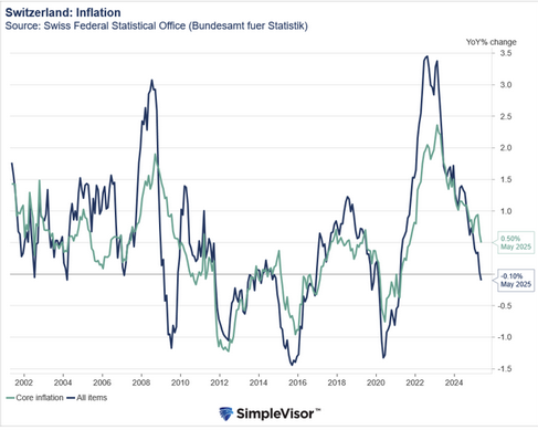
The implicit narrative of the latest rally in stocks is that this is just another normal rally in the ongoing 10-year long Bull market. Nice, but do these three charts look “normal” to you? Let’s take a quick glance at a daily chart of the S&P 500 (SPX), a weekly chart of TLT, the exchange-traded fund of the US Treasury 20-year bond, and silver. In other words, let’s look at three different assets: stocks, bonds and one of the precious metals. Even the most cursory glance reveals there is nothing normal about any of these charts. The recent action in the SPX is anything but normal: yet another announcement of yet another (low-level nothing-burger) trade meeting opens a gap big enough for a semi to drive through, punching through the upper Bollinger Band, and on the heels of a previous big gap up, also on no fundamental news. Look at August: if a month of nearly daily open gaps and manic swings is “normal,” why are such periods so uncommon in “normal” rallies? |
SPX Large Cap, April - August 2019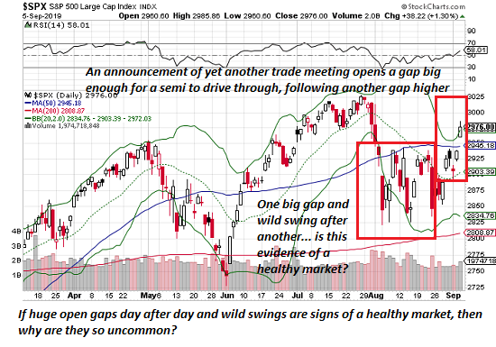 - Click to enlarge |
| Looking at August’s wild schizophrenia, does this strike you as “normal” market action in an ongoing Bull market? If so, perhaps you should dial back your Ibogaine consumption. | |
| Next up, TLT, the US Treasury long bond. You know, the “safe” long bond, which moves glacially compared to risk-on stocks.
If we dare to be honest (risky in a world terrified of honesty), this looks like the blow-off topping move of risk-on bitcoin in December 2017. There is nothing “normal” about this parabolic move in Treasury bonds. |
TLT, June 2018 - August 2019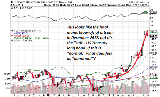 - Click to enlarge |
| Now let’s consider silver, like its precious metal sibling gold, traditionally a hedge against currency devaluations and other risky spots of bother. Since when is a parabolic move higher in the precious metals a sign of a healthy stock market rally or healthy economy? |
Silver Weekly, June 2018 - August 2019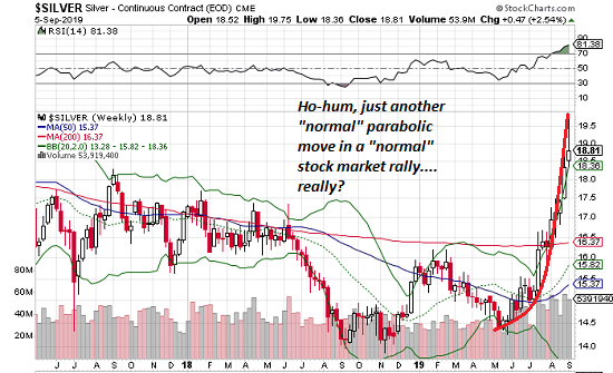 - Click to enlarge |
Um, how about “never”? Let’s face it, these are not charts of a healthy stock market. They’re signs of the manic uncertainty and frenzied churn of traders desperately seeking the next parabolic rally in risk-off hedges.
Again–if these three charts reflect a “normal” “healthy” Bull market, then why are they so uncommon? Quick, let’s talk about liquidity (good), dovish central banks (better) and trade deal rumors (best).
NOTE: Contributions/subscriptions are acknowledged in the order received. Your name and email remain confidential and will not be given to any other individual, company or agency.
Full story here Are you the author?
Tags: newsletter