|
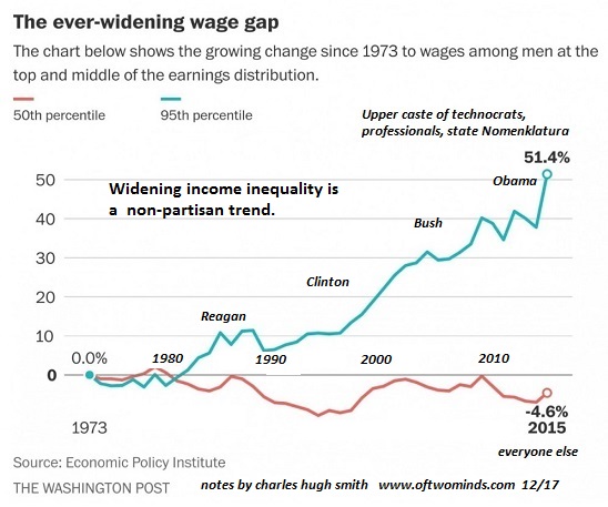
Note that widening wealth and income inequality is a non-partisan trend.
One of the core goals of the Federal Reserve’s monetary policies of the past 9 years is to generate the “wealth effect”: by pushing the valuations of stocks and bonds higher, American households will feel wealthier, and hence be more willing to borrow and spend, even if they didn’t actually reap any gains by selling stocks and bonds that gained value.
In other words, the mere perception of rising wealth is supposed to trigger a wave of renewed borrowing and spending.
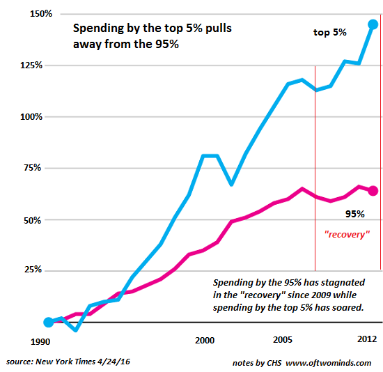
This perception management only worked on the few households which owned enough of these assets to feel wealthier–the top 5%, the top 6 million out of 120 million households. This chart shows what happened as the Fed ceaselessly goosed financial assets higher over the past 9 years: the gains, real and perceived, only flowed to the top 5% of households earning in excess of $200,000 annually.
Spending by the bottom 95% has at best returned to the levels reached a decade ago in 2007.
|
Spending by the top 5% pulls away from 95% |
|
By focusing on boosting financial assets to the moon as a means of goosing spending, the Federal Reserve has widened wealth and income inequality to the breaking point. Perception management doesn’t actually boost the inflation-adjusted wages of the bottom 95%, which have stagnated for decades. Nor does boosting assets do much good for the vast majority of households which have modest holdings of stocks and bonds, usually in IRA or 401K retirement accounts they can’t touch without paying steep penalties.
As the charts below illustrate, the Grand Canyon between the top 5% and everyone else is widening. Let’s say a househould has $12,000 in retirement funds and $5,000 in a savings account. (Many households have less than $1,000 in savings, so this example-household is doing pretty well to have $17,000 in cash and financial assets.)
Thanks to the Federal Reserve’s Zero Interest Rate Policy (ZIRP), savers have lost ground after adjustments for inflation. The stock market has more than doubled, and most bond funds have appreciated, but precious metals and other commodities have not performed as well. So let’s say the household’s retirement portfolio rose by a hefty 75%, or $9,000, to a total of $21,000.
Does this modest gain actually change the financial foundation of the household to the point that the household can now afford to buy a new vehicle, college tuition, etc.? The short answer is no; the gains are simply too modest as a percentage of income to make any difference.
Compare this to a top 5% household with hundreds of thousands of dollars of financial assets: gains registered in the hundreds of thousands do indeed move the needle on household wealth and perception management. The top 5% haven’t just reaped outsized gains in Fed-goosed assets; they’ve also reaped the vast majority of any wage gains generated in the past 9 years of “recovery.”
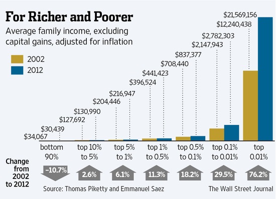
As this chart shows, the bottom 90% lost ground, and the really substantial gains have accrued only to the top 1%.
|
Richer and Poorer Change from 2002 to 2012 |
| Note that widening wealth and income inequality is a non-partisan trend. The political and financial elites have feathered their own nests while the bottom 95% have lost ground. |
The ever-widening wage gap 1973 - 2015 |
Tags: newslettersent


