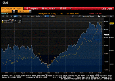
This Great Graphic, composed on Bloomberg, shows two-time series. The white line is the premium the US government pays to borrow over the Canadian government for two years. The yellow line the US dollar against the Canadian dollar.
Even though it appears to be a good fit, our eyes can be deceived, and Bloomberg automatically aligns the scales to show the best bit. However, here the fit is very good.
We ran some correlations to probe the robustness of the fit. Over the last 60 sessions, the US dollar against Canada moves in the same direction as the interest rate spread nearly 90% of the time. It is the same correlation on the level of the USD-CAD exchange rate and level of the two-year yield differential.
The correlation rarely has been higher. The US premium over Canada has fallen by 14 bp today and is back to mid-December levels (~44 bp). The spread has narrowed by nearly a quarter today. It reflects a flight to the short-end of the US yield curve and reduced risks of a March Fed hike. Defying market expectations, the Bank of Canada did not cut rates today. This has seen the Canadian two-year note yield rise eight bp today.
Interest rate differentials trump the drop in oil prices and the continued equity market sell-off today for the Canadian dollar. This is a useful reminder that oil is not the only driver of the Canadian dollar.
Tags: Bank of Canada,Great Graphic


