Thanks to Josh Lehner | September 24, 2012, updated in November 2013 with US employment data, Oregon Office of Economic Analysis Economics Blog
Seeing that it has been a year since the update to Carmen Reinhart and Kenneth Rogoff’s great work on financial crises, I thought it would be a good idea to check in on how the U.S. is doing relative to these other historical crises.
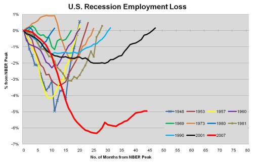
First, the Great Recession is the clearly the worst post-World War II business cycle in the U.S. as evident by comparing job losses.
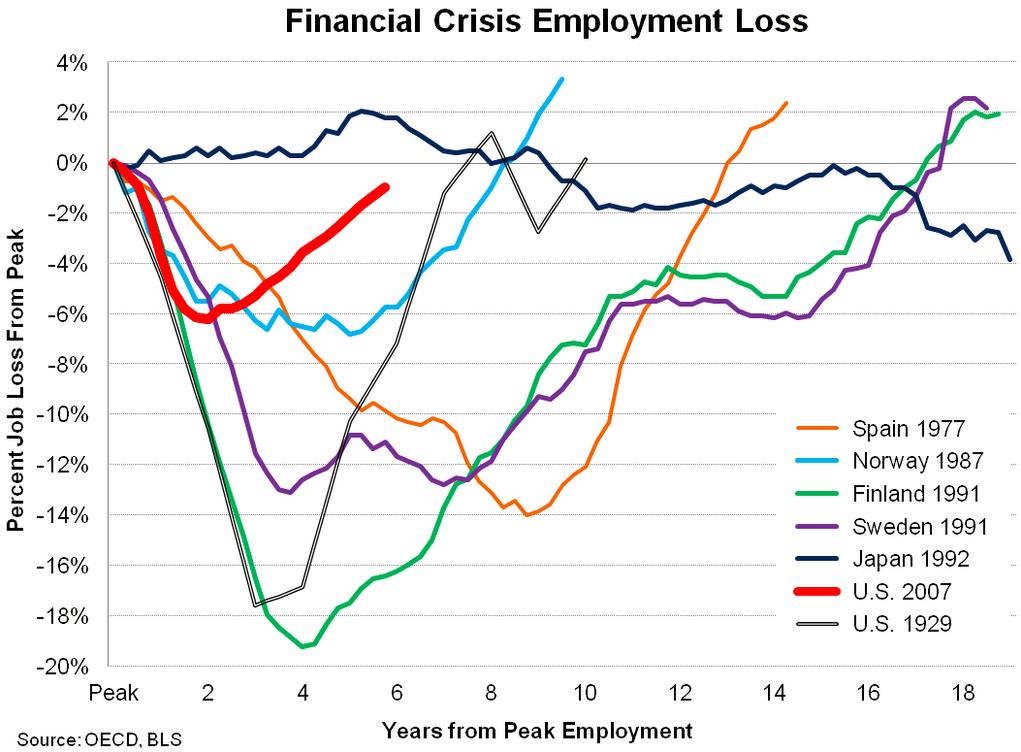
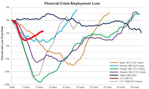
However, when the Great Recession is compared not to other U.S. cycles but to the Big 5 financial crises and the U.S. Great Depression (thanks to U.S. Treasury for adding that to the graph), the current cycle actually compares pretty favorably. This is likely due to the coordinated global response to the immediate crises in late 2008 and early 2009. While the initial path of both the global and U.S. economies in 2008 and 2009 effectively matched the early years of the Great Depression – or worse – the strong policy response employed by nearly all major economies – both monetary and fiscal – helped stop the economic free fall.
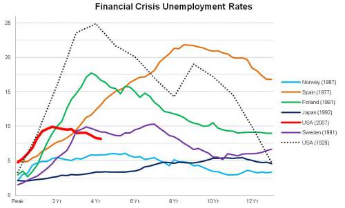
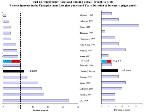
Finally, the last graph is a new one and compares unemployment rates across these same crises. While the current U.S. cycle rate effectively doubled from 4.5% to 10.0%, many other crises’ gains were even larger. In fact, the percentage increase, as opposed to percentage point increase, in the unemployment rate for all crises except Japan were larger than the U.S. Great Recession. Even Norway’s unemployment rate which topped out at just over 6% represented a near tripling of the pre-crisis rate of 2.1%. Note that the unemployment rate peak used here is the 12 month average preceding each crisis.
This Time is Different, An Update
Thanks Josh Lehner | September 19, 2011
The following provides an update on the great research that Carmen Reinhart and Kenneth Rogoff conducted regarding the build-up and subsequent bust of historical financial crises. While their work on crises was largely conducted in the time period leading up to and directly after the financial meltdown in late 2008, there does not appear to be any updates now that the U.S. economy has been in technical recovery for over two years at this point. Some of the facts and figures cited in This Time is Different and the authors’ academic papers were still a work in progress at publication date given that events were ongoing. With the benefit of hindsight, a longer time span and revised economic data (always a luxury), I have recreated and updated some of Ms Reinhart and Mr Rogoff’s work. Specifically, what follows (PDF – full version) is based on their draft paper for an American Economic Association presentation in January 2009 “The Aftermath of Financial Crises.“
In order to not bury the lede, first up is a quick summary of the U.S.’ current experience relative to historical financial crises, followed later by graphs for each individual measure.
All told, the recent U.S. financial crisis looks very similar to the historical crises as detailed by Reinhart and Rogoff – just your “garden variety, severe financial crisis” if you will. Across each of the five measures discussed in the Aftermath paper, the current U.S. experience is of the same magnitude.
However the U.S. labor market has performed better than 4 of the previous Big 5 crises, as identified by Reinhart and Rogoff, in terms of job loss and the return to peak time line.
The question that naturally follows and is not answered here is why does the current U.S. cycle measure up in terms of the aftermath of financial crises except in the percentage of employment loss? Relative to Spain, Norway, Finland and Sweden, it appears that the U.S. did something right. Is it as simple as ARRA? Is it TARP and the backstopping of the financial industry? Is it the fact that, more or less, the world had a coordinated response in late 2008/early 2009 for expansionary fiscal and monetary policies?
________________________________________________________________________
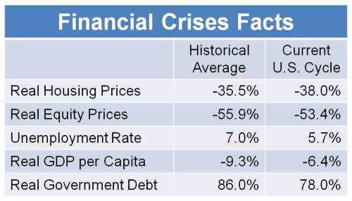
Given the following historical facts (averages) that Reinhart and Rogoff found in their research, the purpose here is to find out how the current U.S. cycle compares.
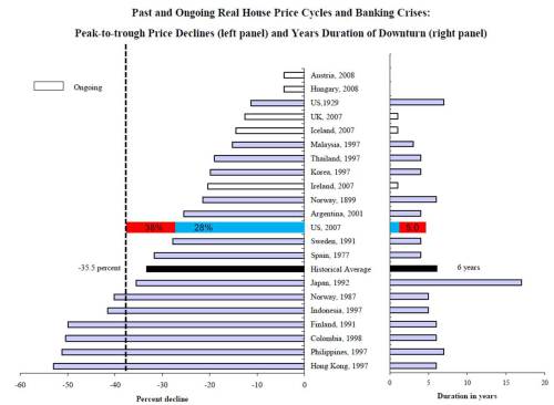
Through June 2011, the S&P/Case-Shiller home price index (either the 10 city or 20 city composite) has declined 38 percent in real terms since mid-2006 while the historical average saw a decline of 35.5 percent over 6 years. There has been no definitive or sustained upturn in home values to date so this calculation is still a work in progress as prices may fall further and/or the decline may last longer than the current 5 years.
The historical average for percentage point increases in the unemployment rate was 7 percent over nearly 5 years. The U.S. employment rate this cycle increased 5.7 percentage points (from 4.4 to 10.1 percent) over approximately 3 years.
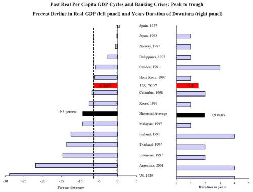
Real Per Capita GDP typically declines 9.3 percent, while the U.S. fell 6.35 percent from 2007 Q4 through 2009 Q2. Note that this calculation does include the most recent BEA revisions.
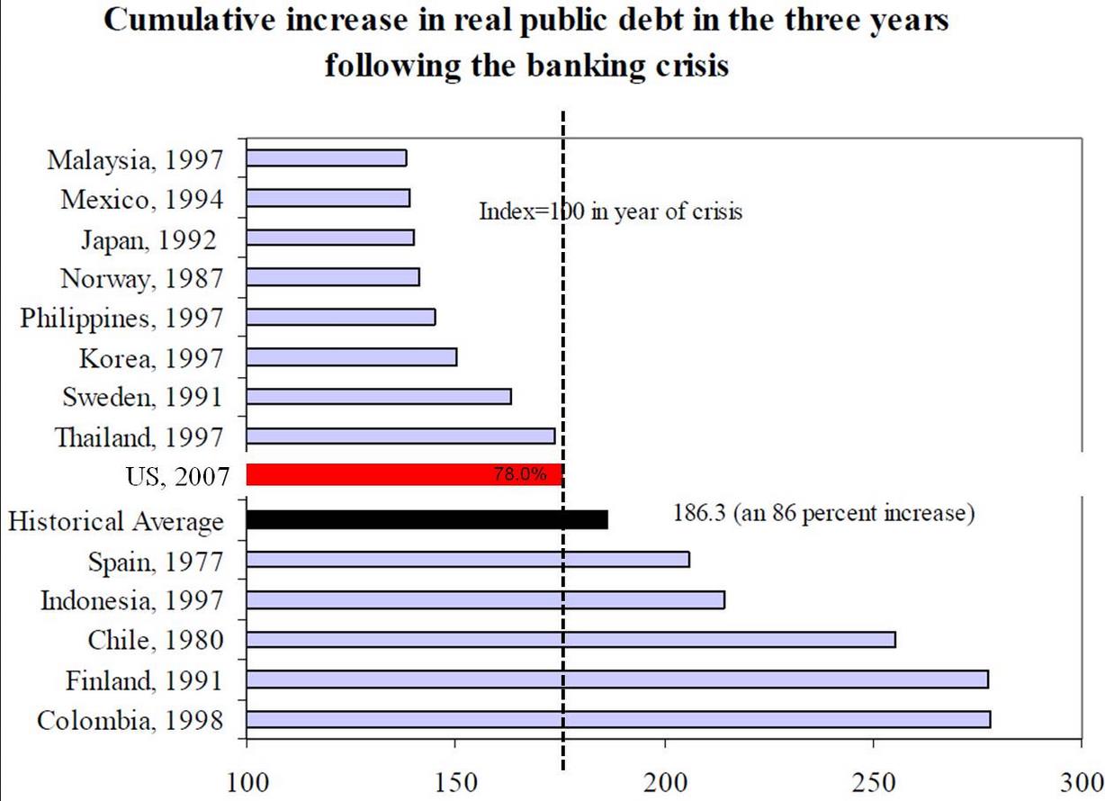
During the first three years after a crisis, public sector debt increases, on average, slightly more than 86 percent. Using the U.S. Treasury’s Debt Held by the Public figures, in the U.S. real debt has increased 78 percent from July 2008 through July 2011.
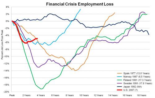
One item not addressed in their Aftermath paper is the actual level of employment and its large declines during and after crises. The following graphs provide context for how far U.S. employment has contracted during the most recent business cycle. The first graph is the standard, U.S. employment return to peak which compares the U.S. performance over post-WWII recessions. The current cycle is termed the Great Recession (or Lesser Depression, depending upon whom you ask), and with good reason. It is clearly the outlier in terms of job loss.
However, in the context of the Big 5 financial crises, the current U.S. cycle suddenly does not look quite as dire. Notice how the x-axis, how long it takes to return to peak levels of employment, is measured in years(!) not months like the first graph.
All told, the recent U.S. financial crisis looks very similar to the historical crises as detailed by Reinhart and Rogoff – your “garden variety, severe financial crisis.” However the US labor market has performed better than 4 of the previous Big 5 crises and Japan’s economic and employment experience over the past twenty years is unique in its own right.
Click here for the complete set of slides in PDF which includes another graph and data notes.
See more for


